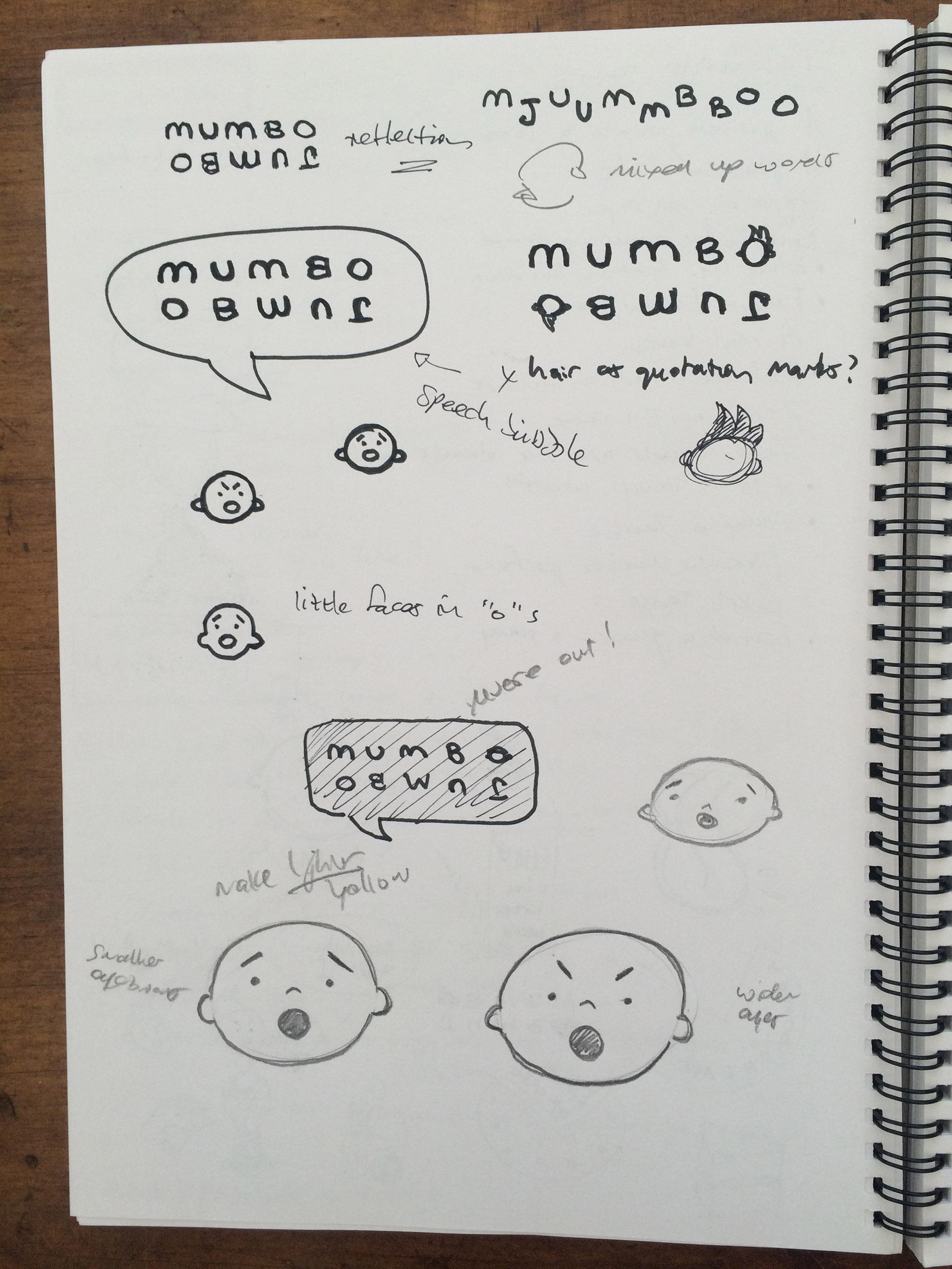
I very quickly decided to design the words as a reflection, so that the identical letters weren't below each other if doubled up. The two "o"s at each end reminded me of faces that could express the meaning of the words. The speech bubble seemed a natural element that could pull the whole design together.
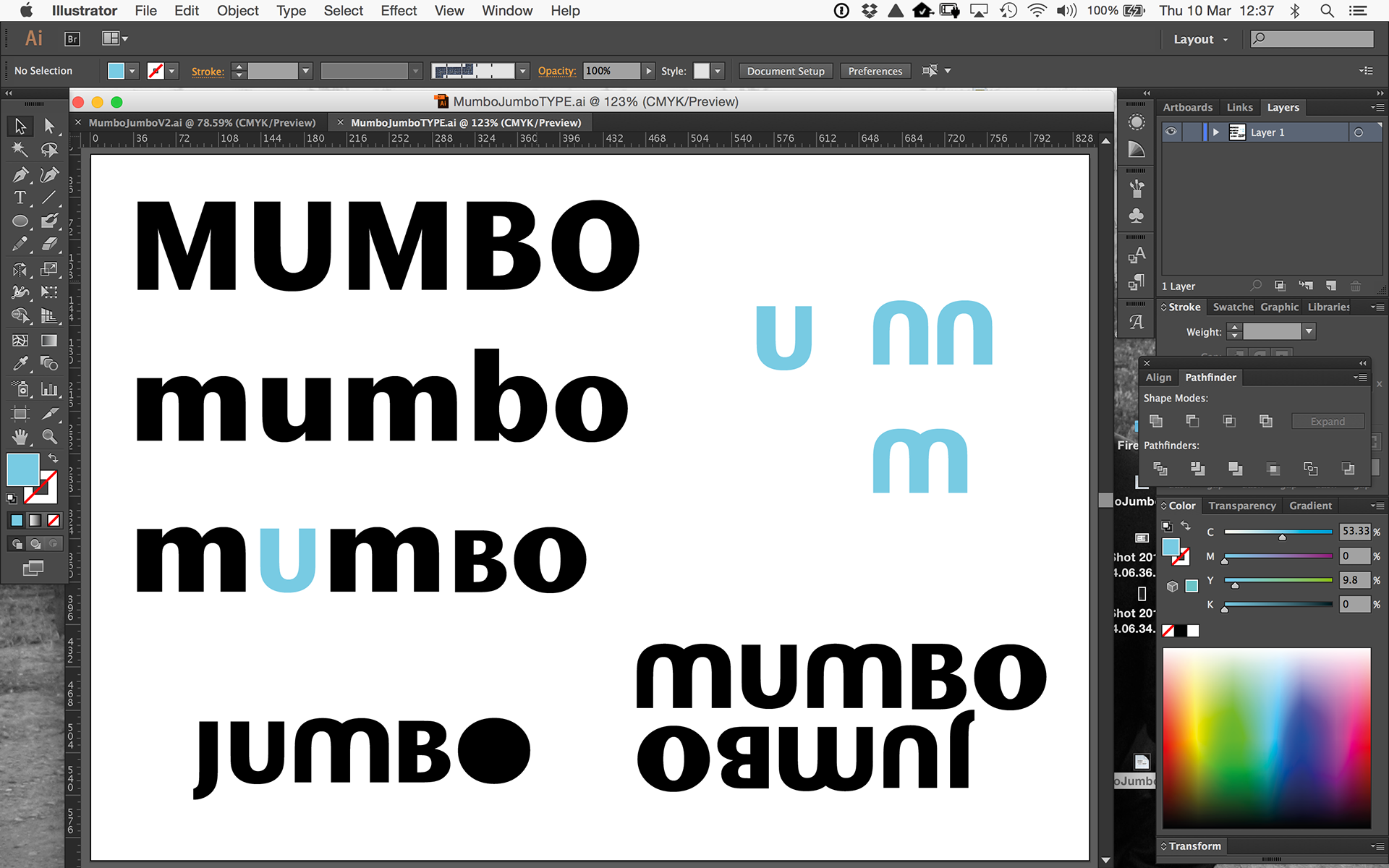
I found a typeface that contained letter forms I could manipulate easily. A mix of caps and lower case had to be used. I flipped the "u" and copied it to make up a letter "m" that was not serif. I also elongated the "B" and deleted the centre of the "o" to form the basis of the face.
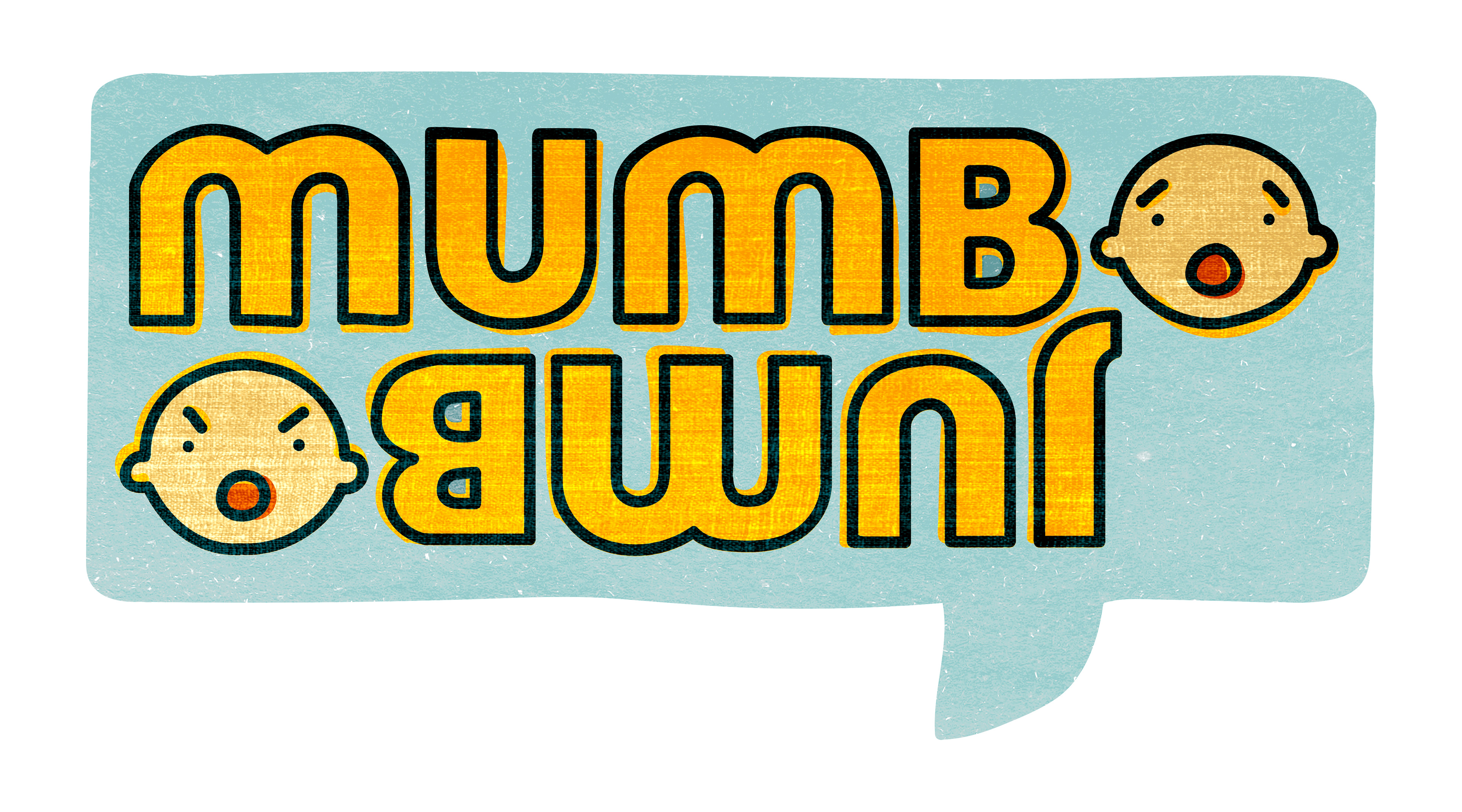
Colour combinations were played with, the little faces illustrated and texture added as overlays.
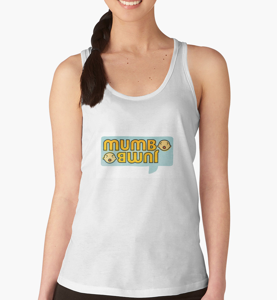
Purchase this design on Redbubble products (Clothing, home decor, stickers, cases etc.)