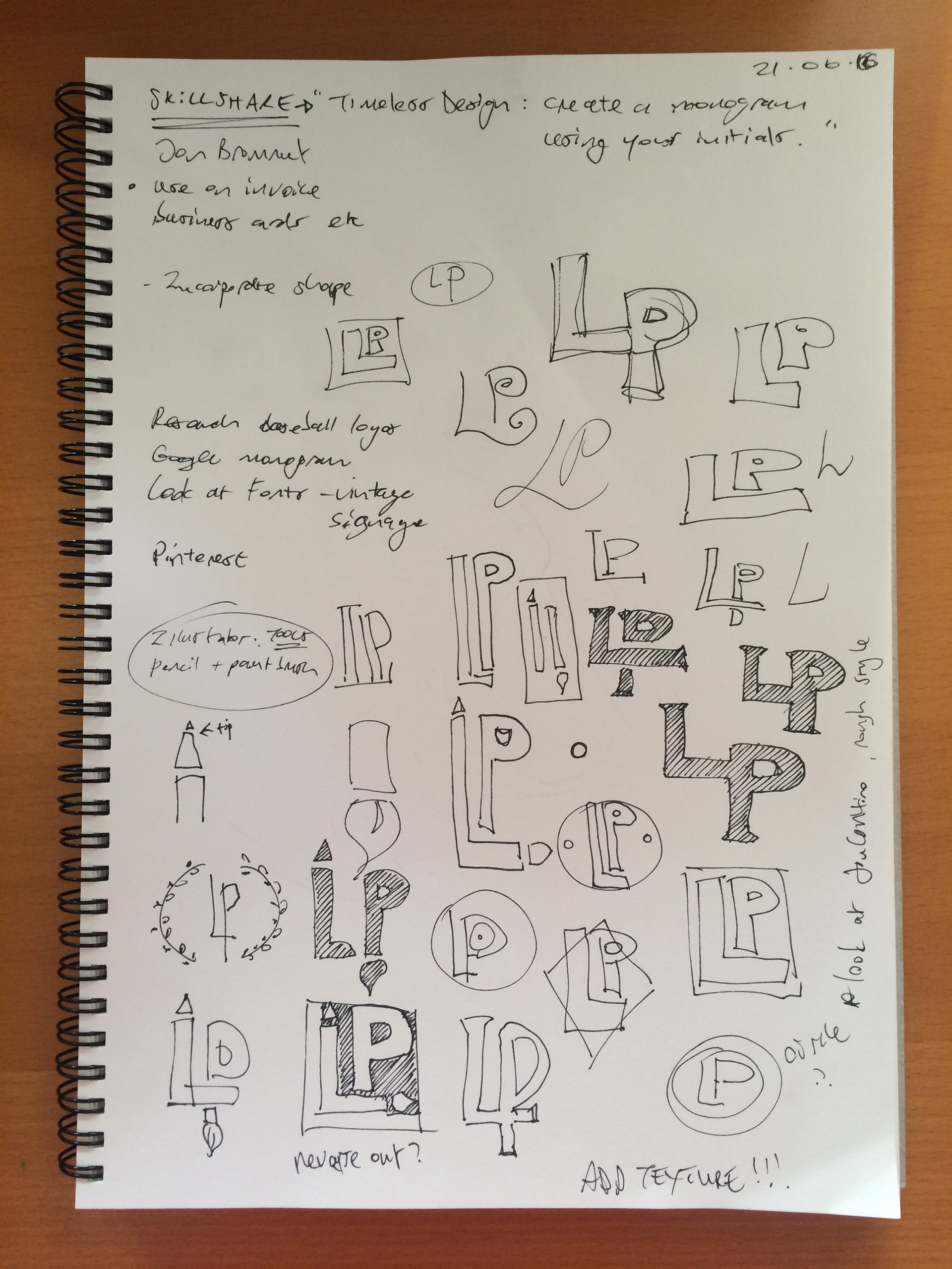
My sketchbook above shows my thinking and initial thumbnails. The long elongated shapes of the "L" and the "P" allowed for some playful ideas to emerge. I turned them into an illustrator's tools... a pencil and a brush. (I once met an illustrator who had a long pen tattooed on the inside of one forearm and a paintbrush on the other, so cool!)
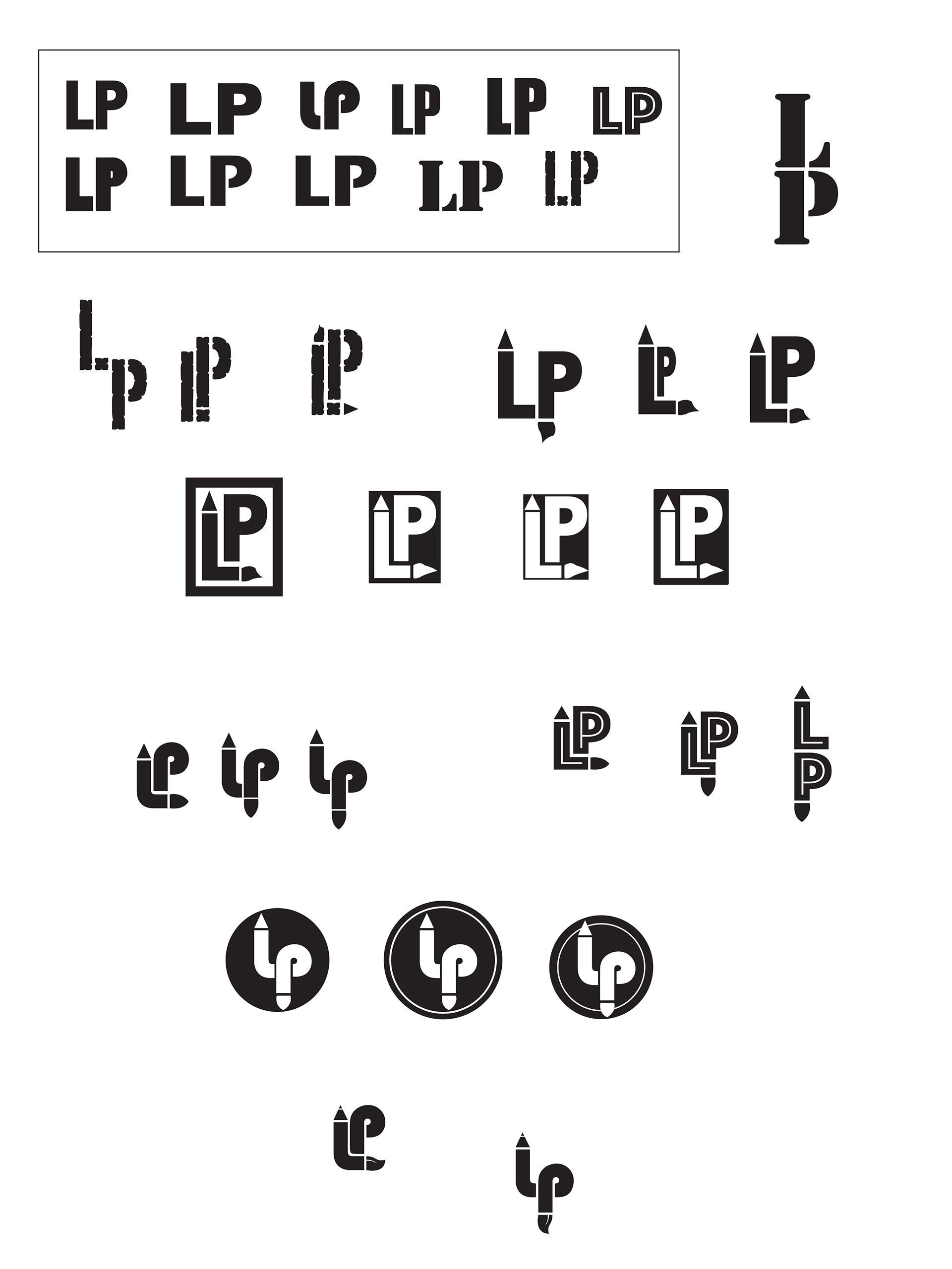
I then started working in Adobe Illustrator, choosing a variety of different fonts that seemed appropriate for the design I wanted to create. I settled on Bauhaus 93 as it's a quirky font that flows beautifully and creates some interesting shapes. I also added the pencil "tip" and painting "brush" end.
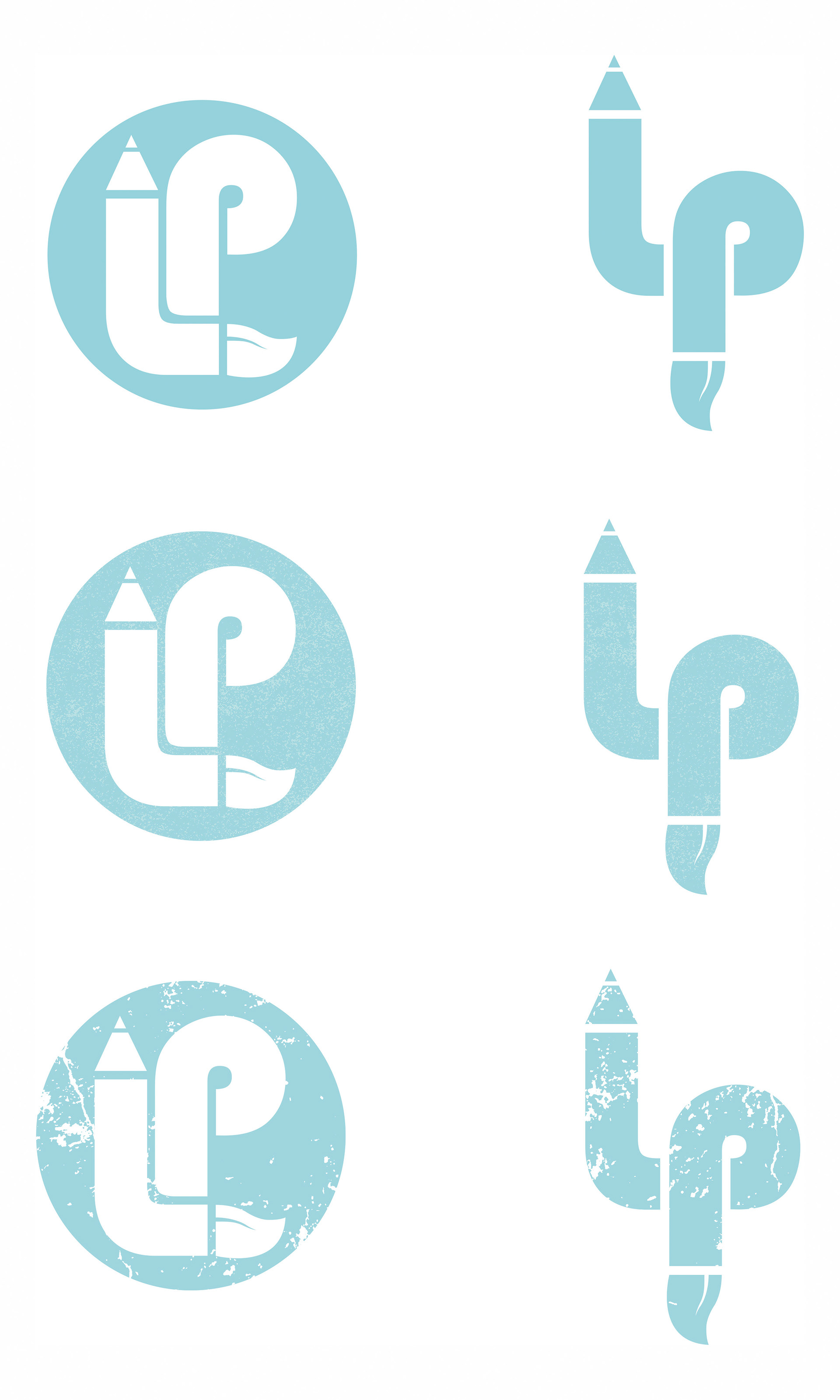
I spent a while finessing the design and adding colour and texture for interest - the bottom two monograms were my final choices. I have used them both in my website as I think they each bring a different look and feel to the space they are used in.